Project 1: Children’s Book Design with Stationary
Assignment: Define a business, its target audience, and its positioning strategy based on the word Sova (Slovak for Owl). Decide what the company sells or does. Design a logo, stationary package, a 4-page brochure, and an item.
Design Brief: SOVA: Personalized Electronic Children’s Bedtime Story Books
Sova is a book production company that publishes/sells personalized electronic children’s books that illustrates various bedtime stories. The target audience is individuals with children or anybody who is around/interacts with children. Sova electronic bedtime story books are sold at Barnes & Noble, Nordstrom, and online through the Sova website.

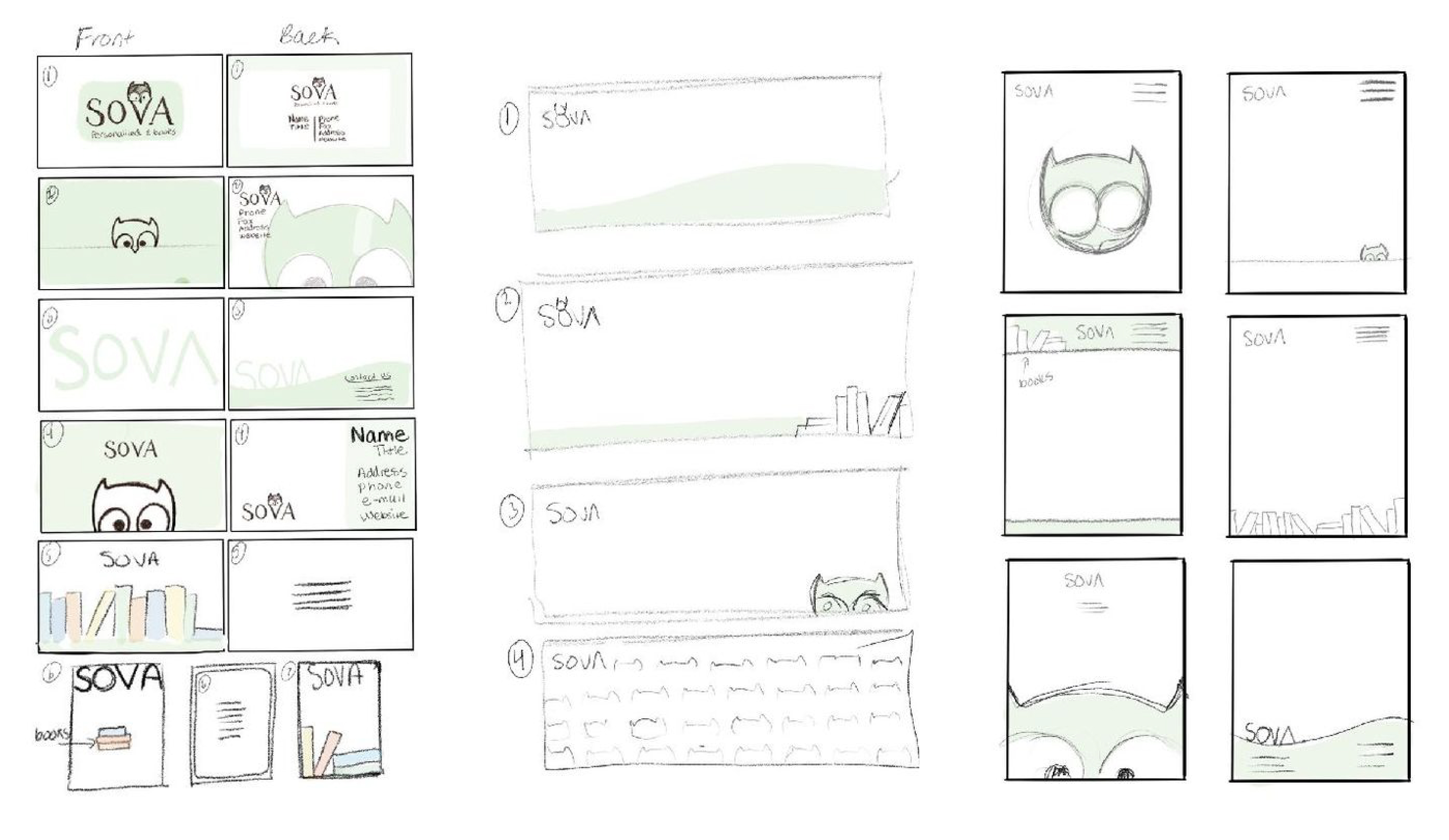
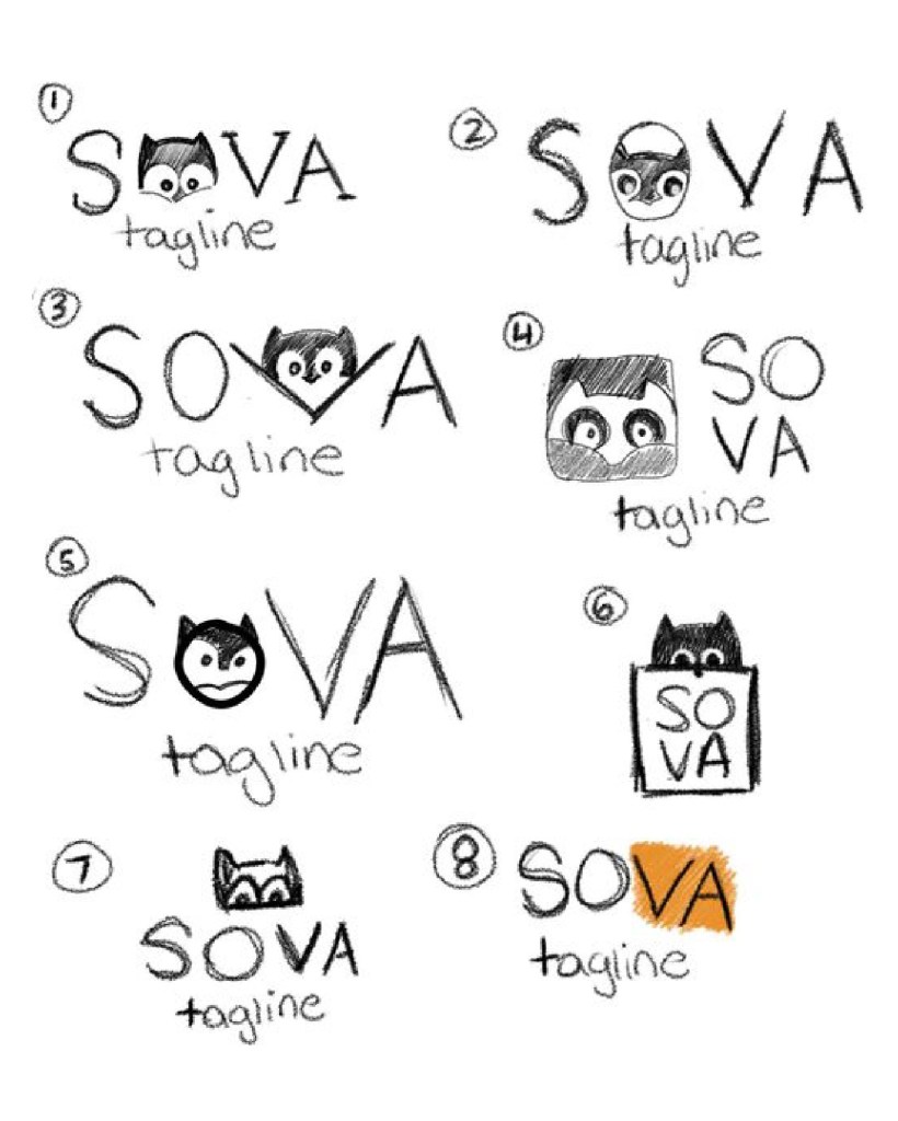
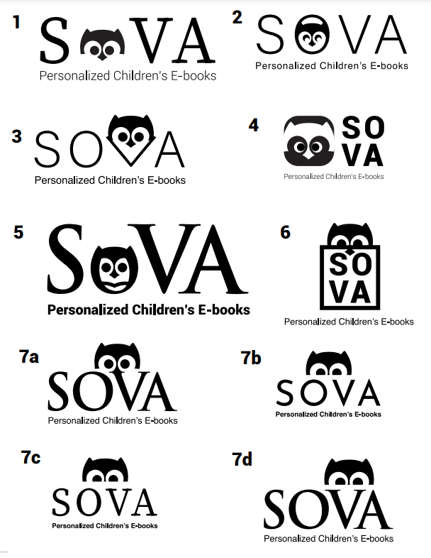
SOVA hand-drawn logos were converted to a digital logos in Adobe Illustrator
Left: Sova means owl in Slovak. An owl symbolizes eyes, clouds, quietness, and nighttime. Sova is a business that sells specialized baby books to read at night. Right: Digitally drawn Sova marketing materials which includes a business card, a letterhead, and an envelope.
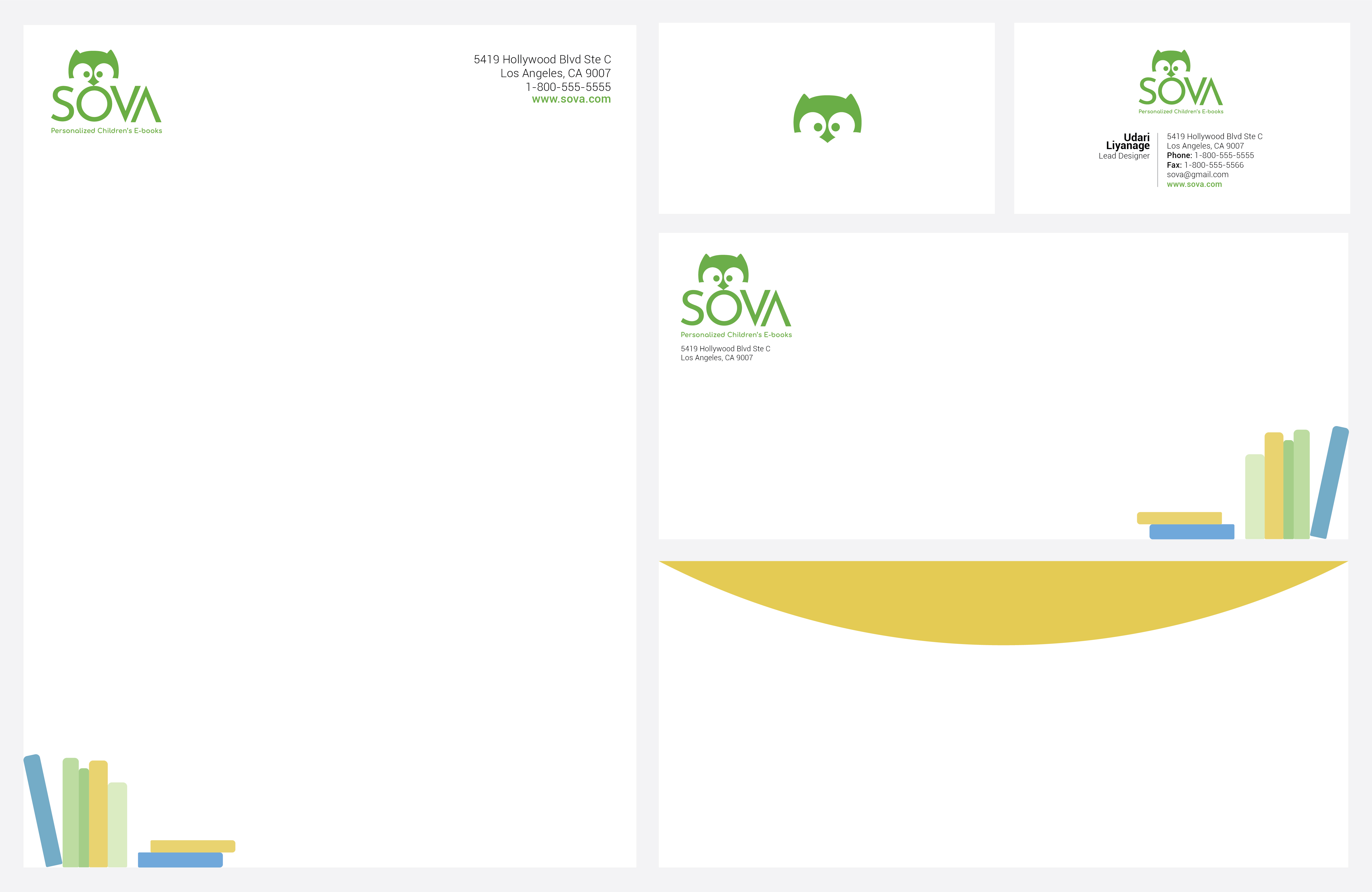


Left: Sova letterhead, business card (front and back), and envelope (front and back) Top right: Sova logo, Sova colors include yellow, green, blue and gray. Bottom right: Sova electronic book and matching colorful bookmarks.


A 4-page brochure includes the mission statement, what sets Sova books part from its’ competitors, what can be found inside Sova books, available book themes to purchase, and contact information.
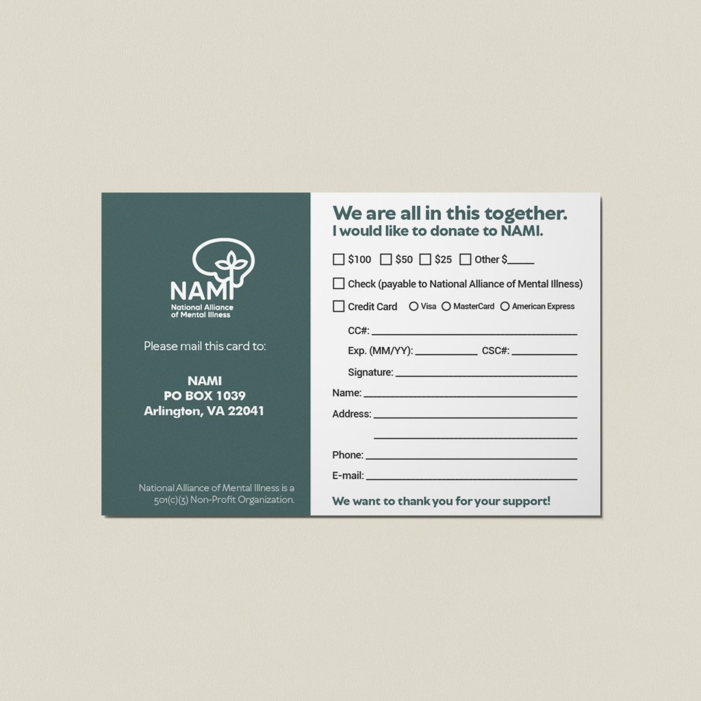
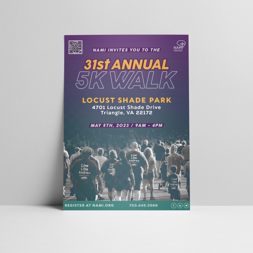
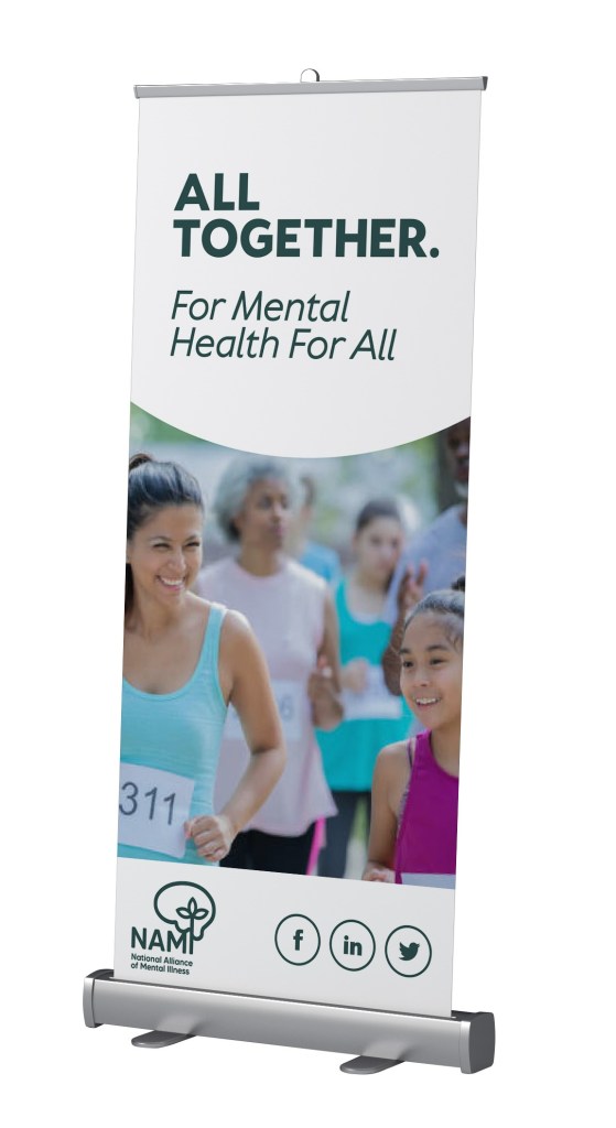
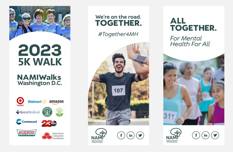
Project 2: Rebranding – National Alliance of Mental Illness
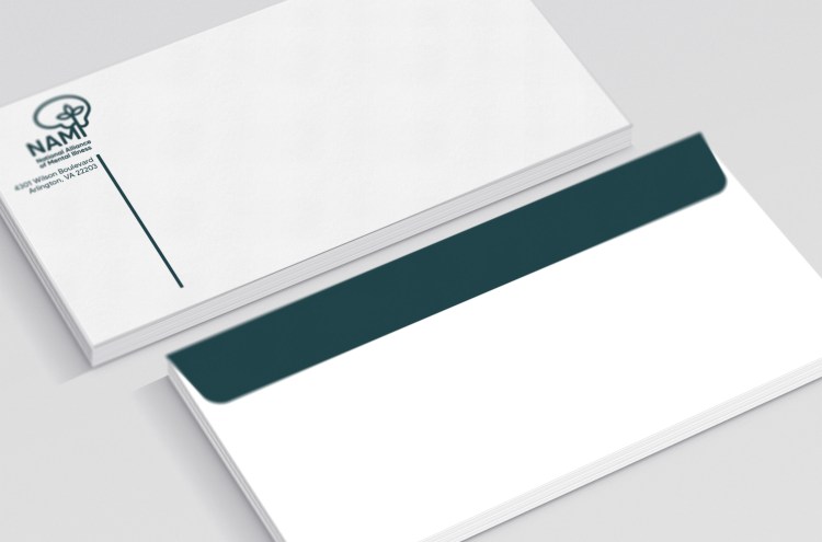
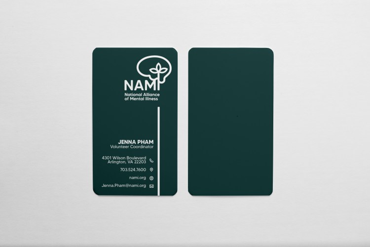
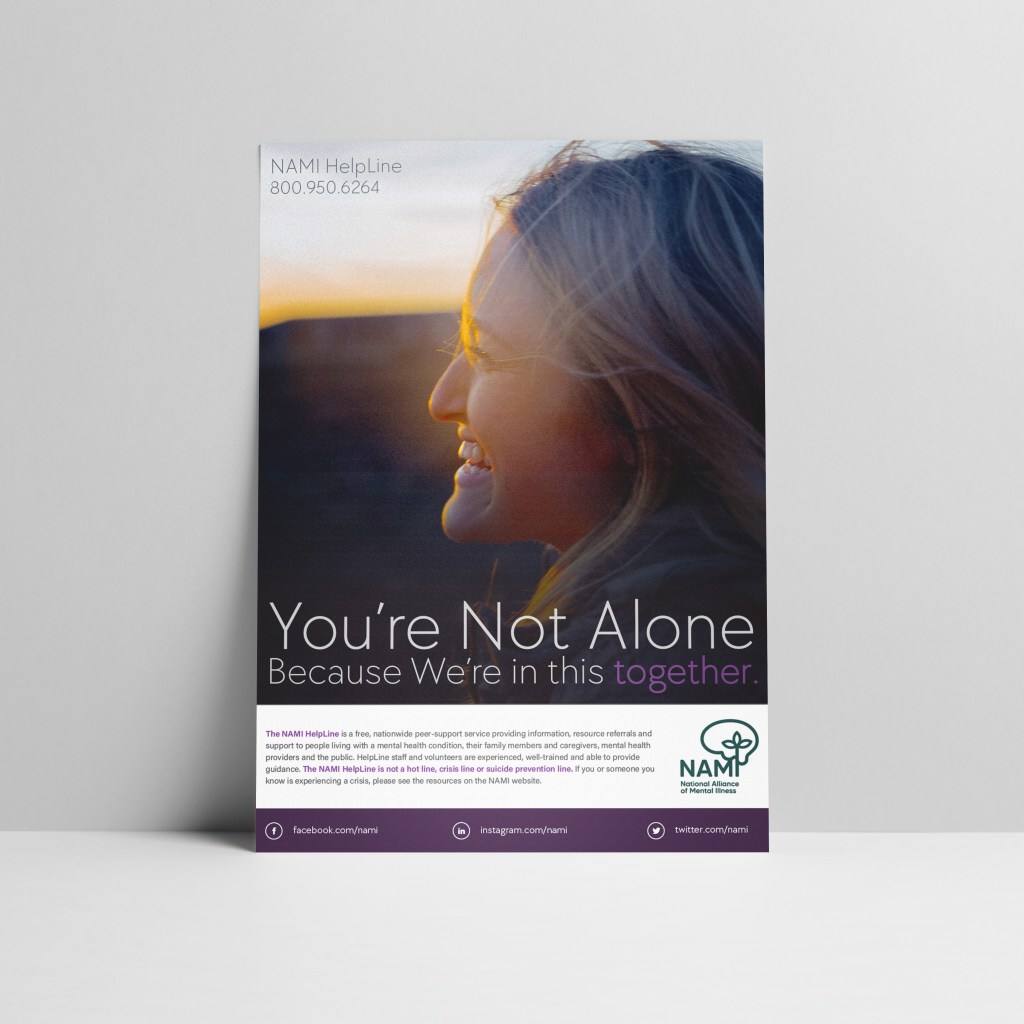
The National Alliance of Mental Illness or NAMI is the largest grassroots mental health nonprofit organization in the United States. NAMI provides advocacy, education, support, and public awareness to community members who are dealing with mental health problems. NAMI’s values include hope: a possibility to recover, inclusion: embracing all backgrounds, empowerment: promoting confidence, self-efficacy, and service, compassion: practicing respect and kindness, and fairness: fighting for equity and justice.


STATIONARY


MARKETING
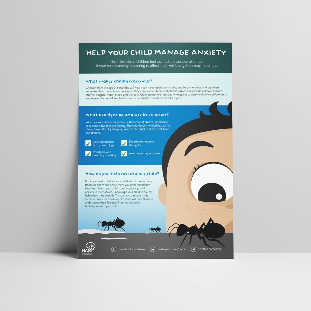
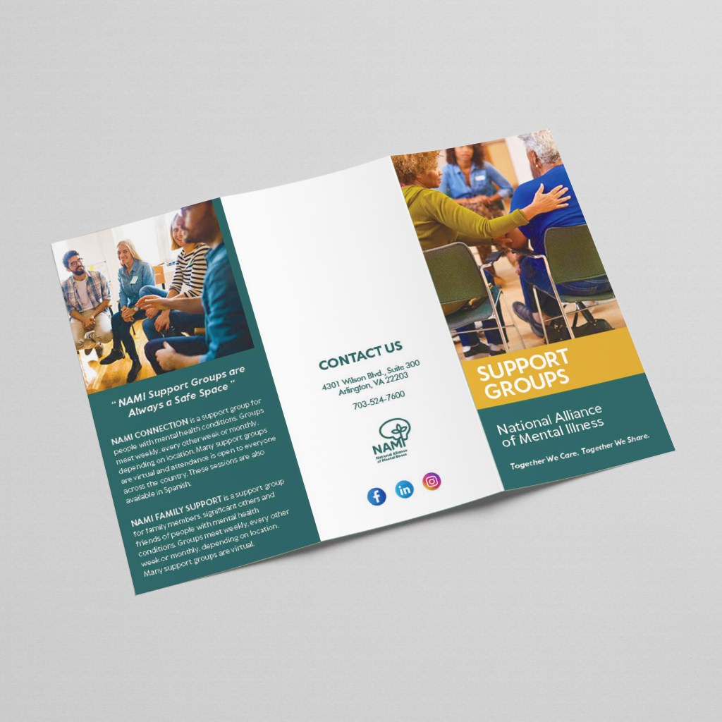
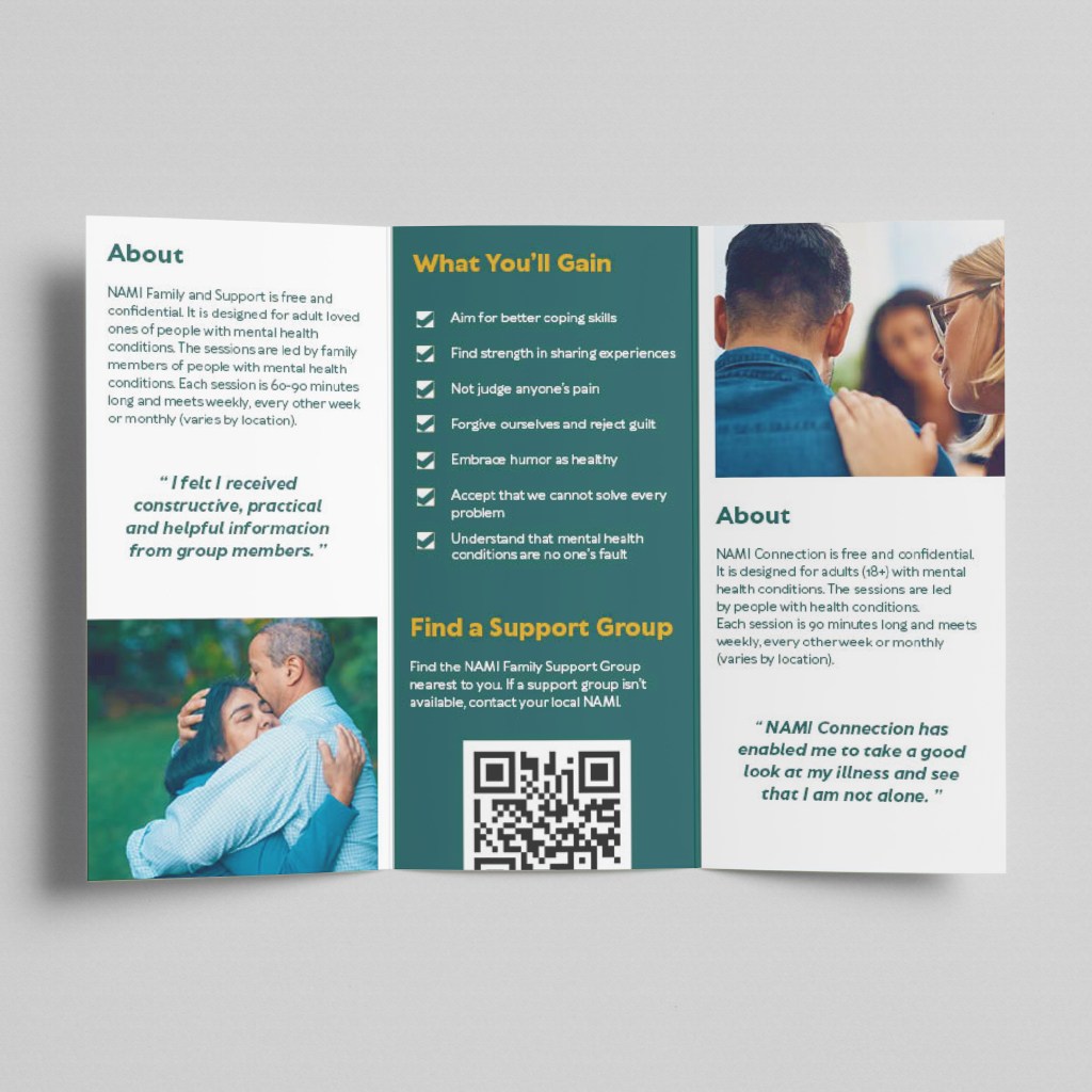

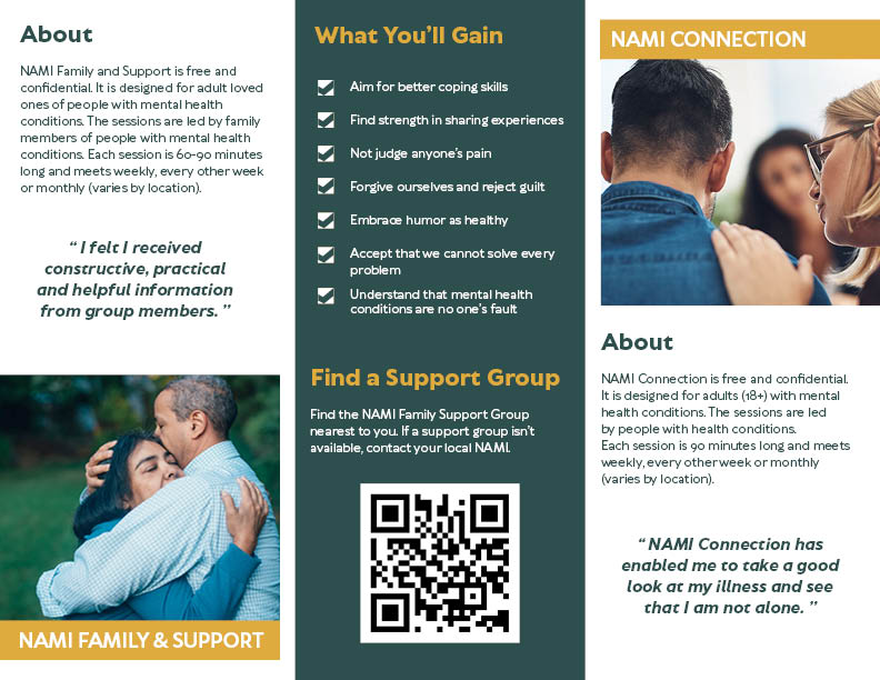
EVENTS


Project 3: Children’s Clothing Store
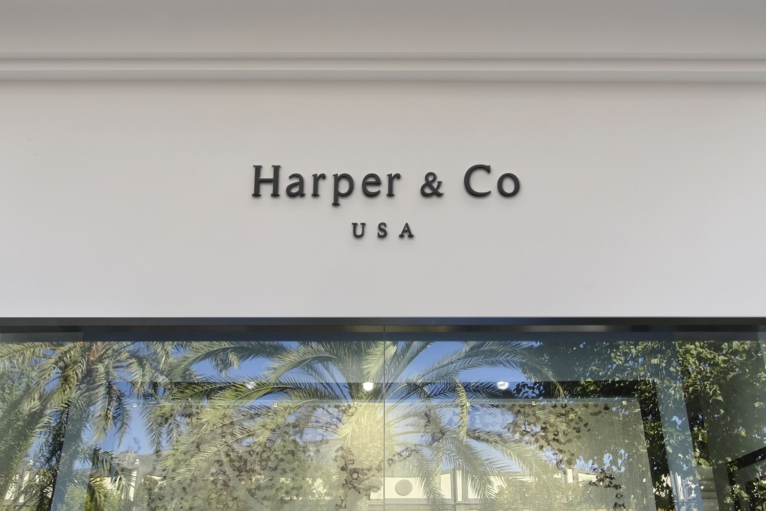
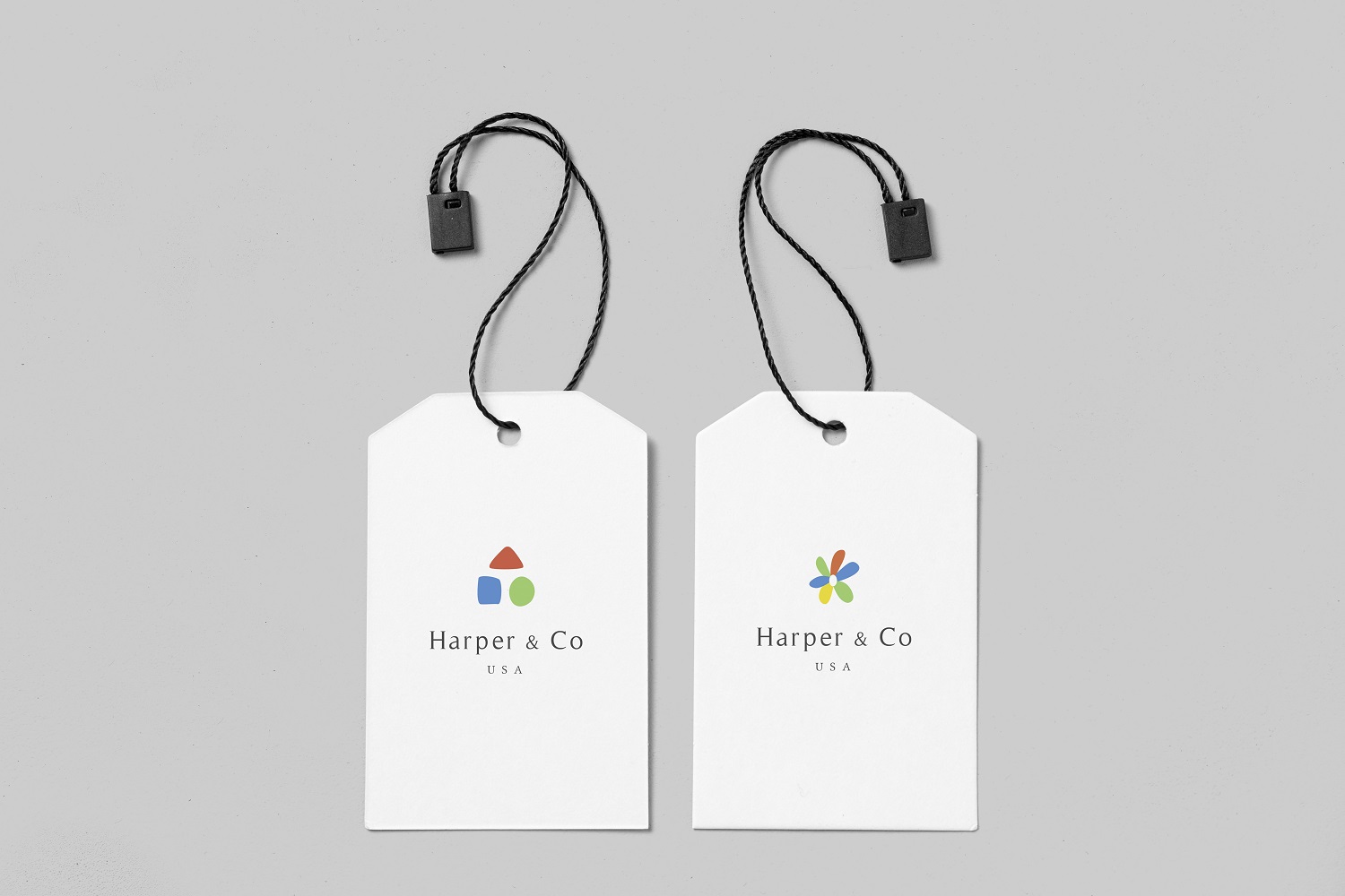
Harper & Co
Harper & Co is an American high-end children’s clothing store located in California. Harper & Co sells children’s apparel including tops, pants, dresses, onesies, socks, hats, and hair accessories. Harper & Co’s brand identity is simple, clean, and chic to represent the expensive of a range of products. Color palette include red, blue, yellow, and green. Founded in 2020, Harper & Co sells its products through retail stores, its website, and in other retail outlets such as department stores.


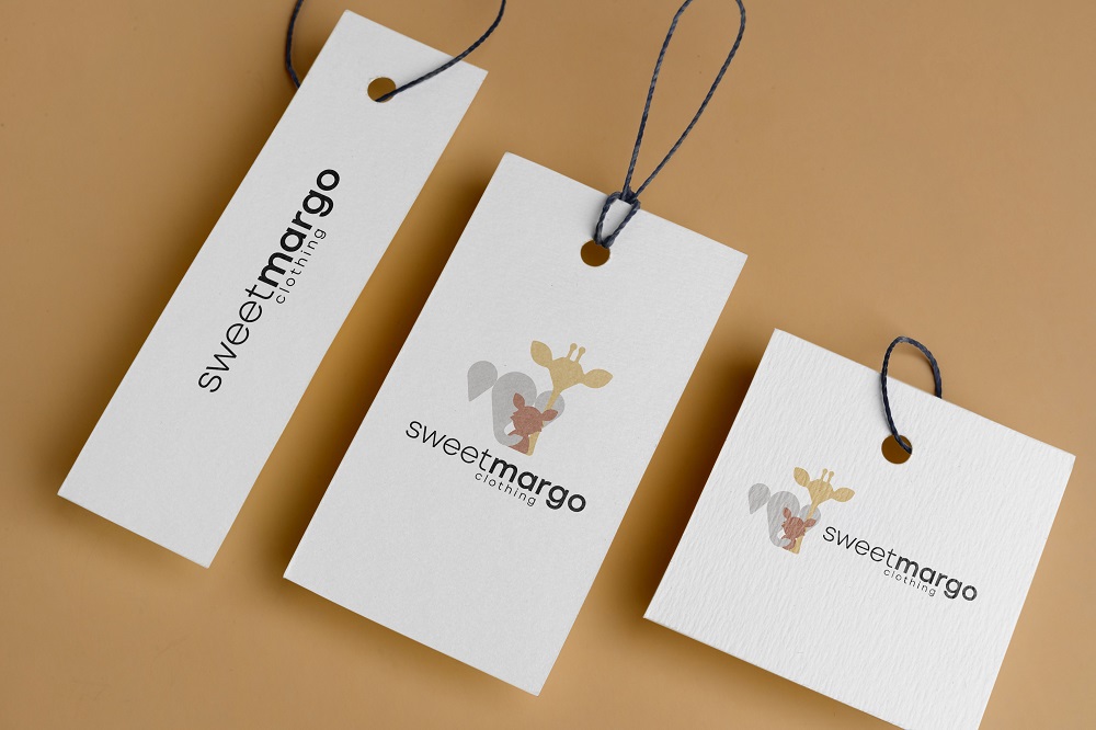
Sweetmargo
Sweetmargo is a children’s clothing store that sells clothing and toys for children aged 1-4 years old. Started as an online store in 2021, Sweetmargo grew to have retail stores in Virginia, Texas, and Illinois. Sweetmargo’s brand identity shows that it is kid friendly. The logo symbol is an image of a elephant, a giraffe, and a fox to depict that it is store for children. The main brand colors are a burnt orange and black.


Project 4: Paint Shop
Yulia’s is a paint store that offers painting sessions by professional artists in the Northern Virginia area. Yulia’s paint store offer a range of affordable private and public paint and sip parties for all ages, groups and talents. Visit yuliapaintanddrink.com to see the calendar and book your session!
Project 5: Kandyhub
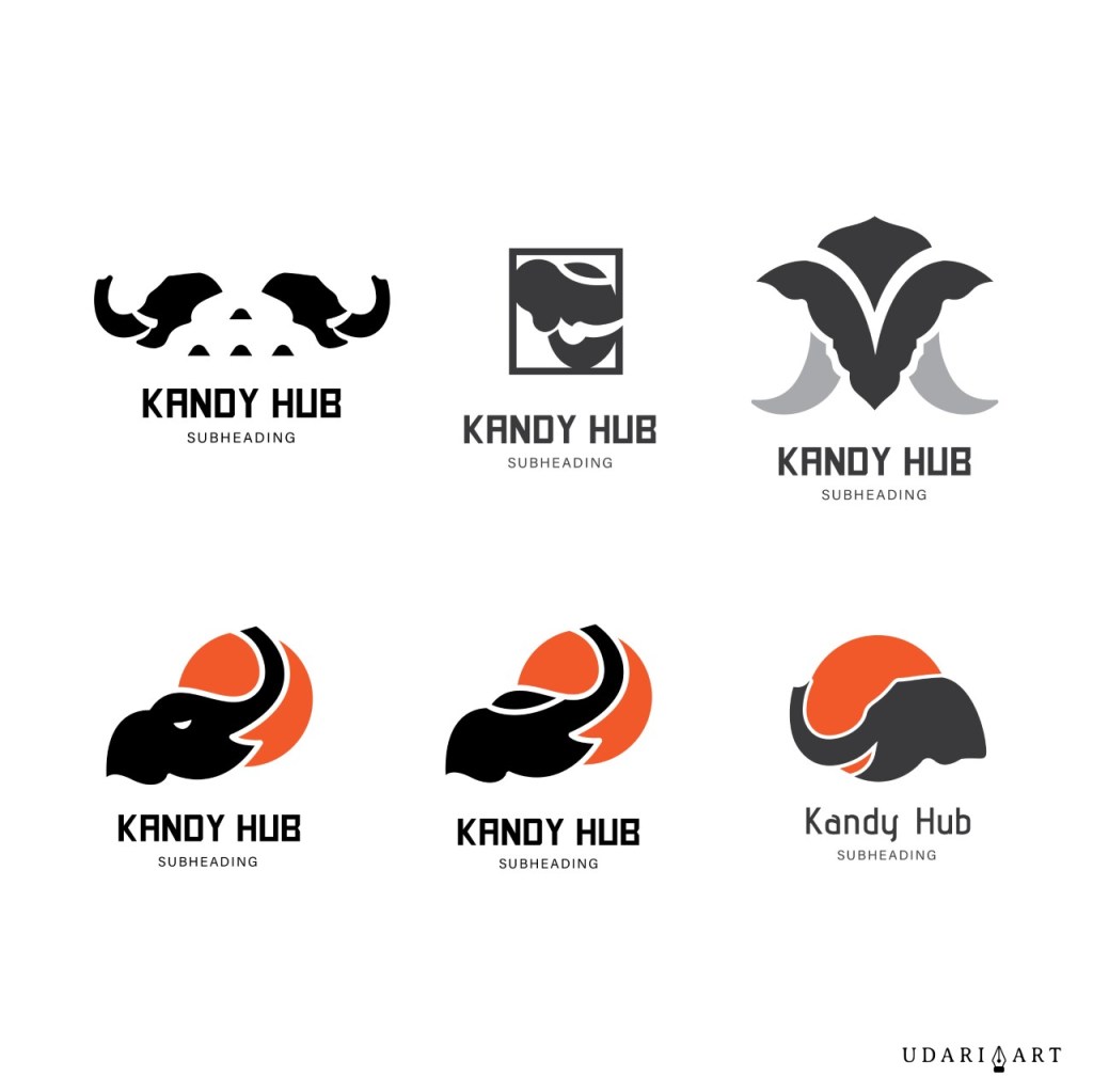
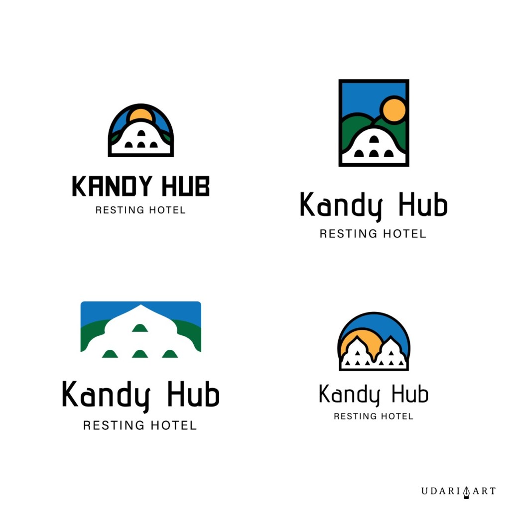
Kandyhub is a tourist hotel located in Kandy, Sri Lanka. Logo sketches were inspired by the city of Kandy, which is famous for the sacred Buddhist sites, including the Temple of the Tooth.


Project 6: Cuttery
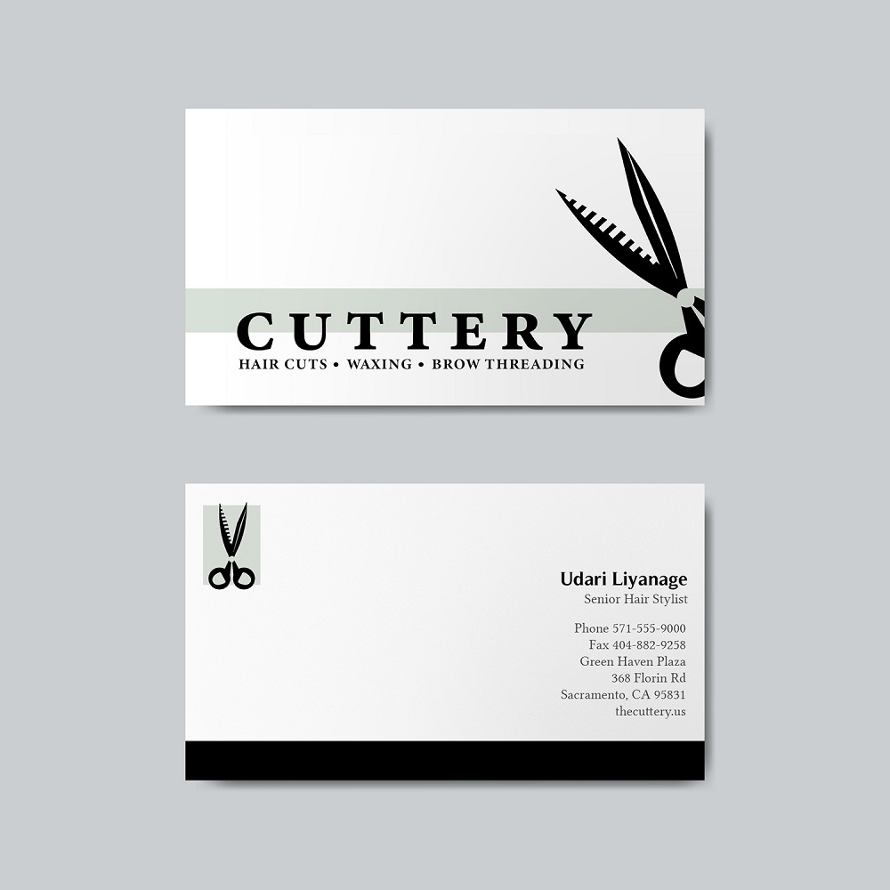
Cuttery is a hair salon that provides hair cuts and styling for men and women, waxing, and brow threading.
Project 7: String Noodle
String noodle is a Chinese family restaurant that offers authentic Chinese food, and a buffet for lunch. Brand colors include red and white. Logo symbol shows a red bowl with stripes to represent noodles, an egg, and chopsticks.


Project 8: Coffee Shop
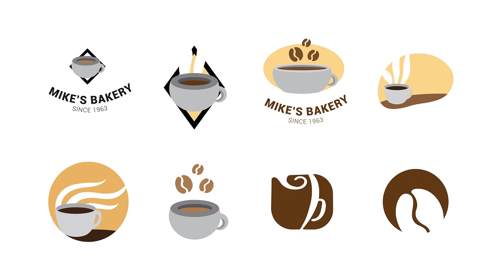
Mike’s Bakery is a famous café and bakery located in a busy shopping center in Arlington, Virginia. Started in 1963, Mikey’s Bakery is famous for it’s coffee made out of special imported coffee beans and it’s friendly atmosphere. The coffee shop’s main audience target is individuals aged 20-40s.
Project 9: Sufi’s Surfing
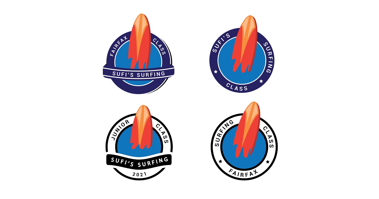
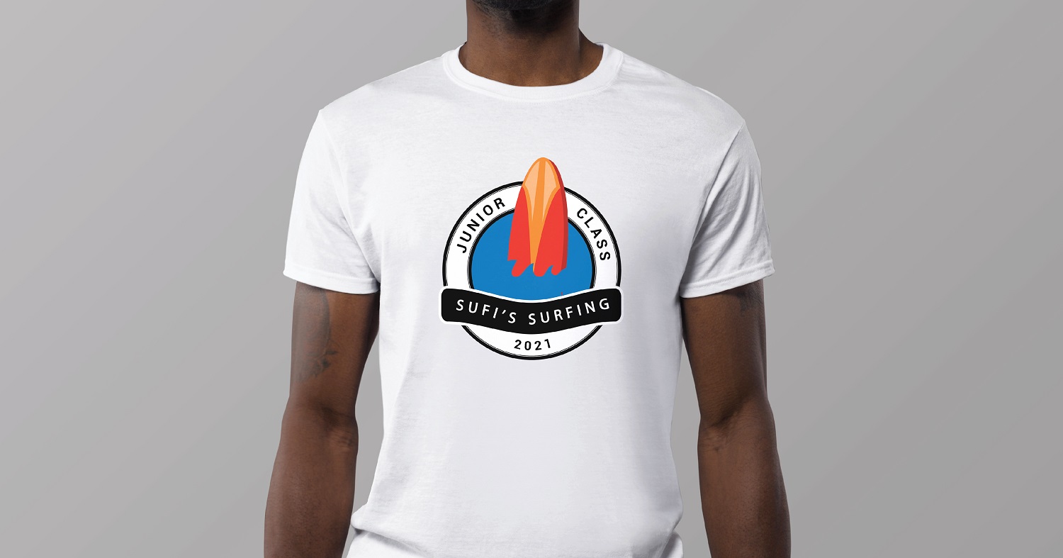
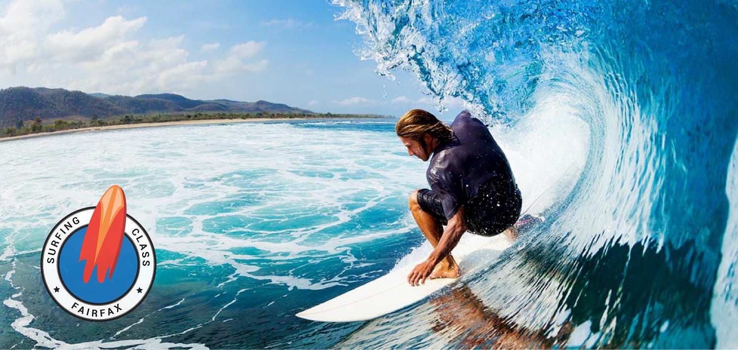
Sufi’s Surfing is a surfing class that provides surfing lessons by two professionals. Classes are in-person and is a month long. Classes are for children and adults. Class registration can be found at sufisurfing.com. Sufi’s Surfing’s brand colors are blue and orange.
Project 10: Take Your Kids to Work Day
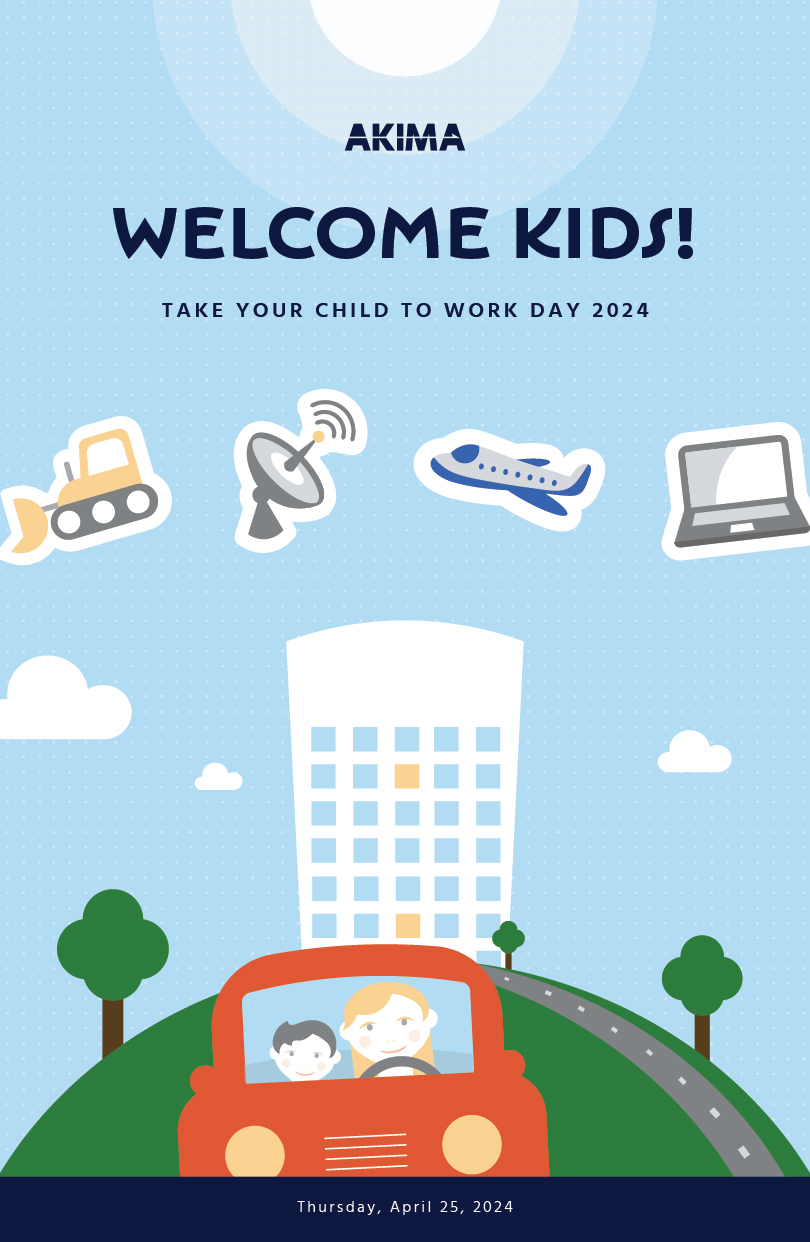
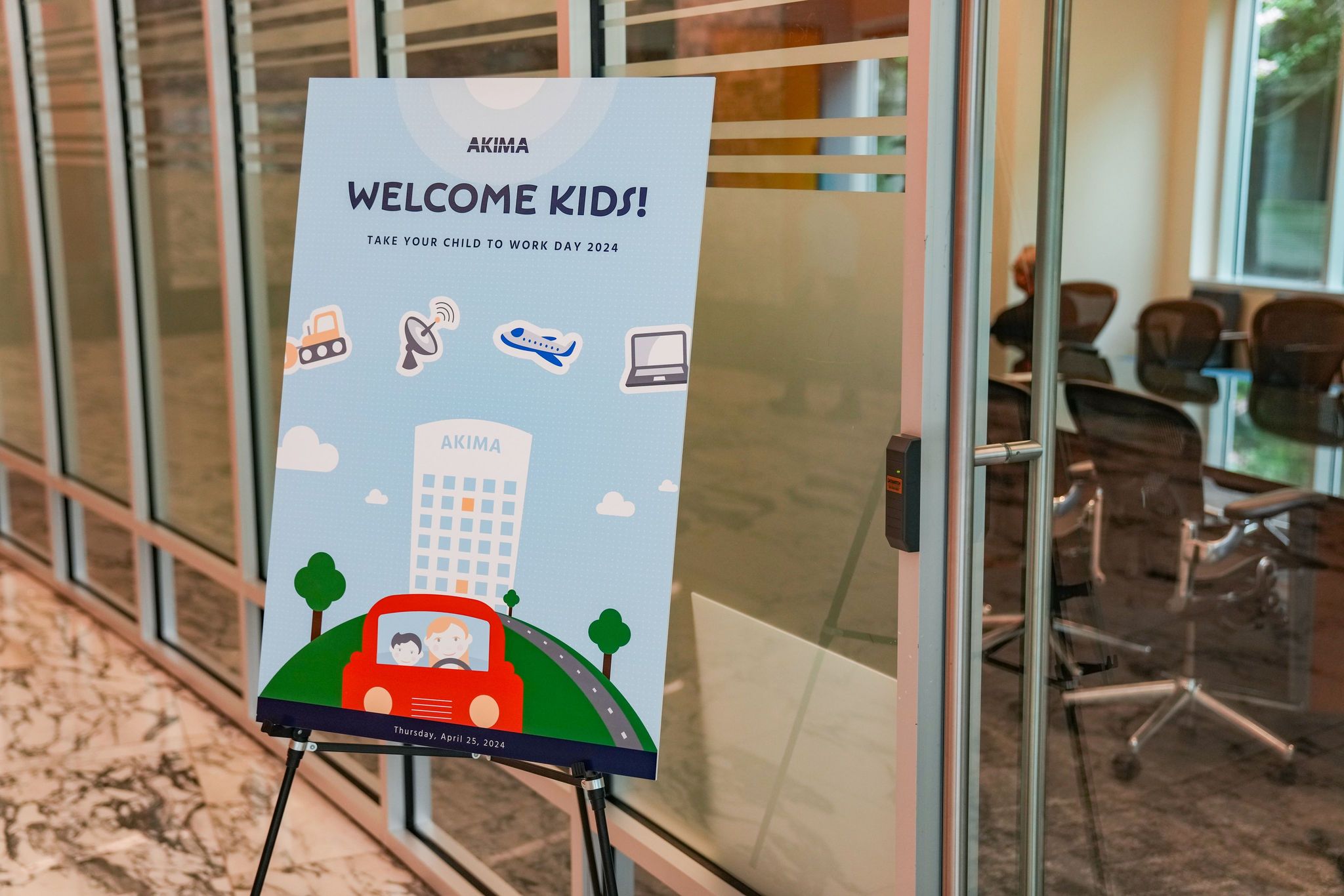
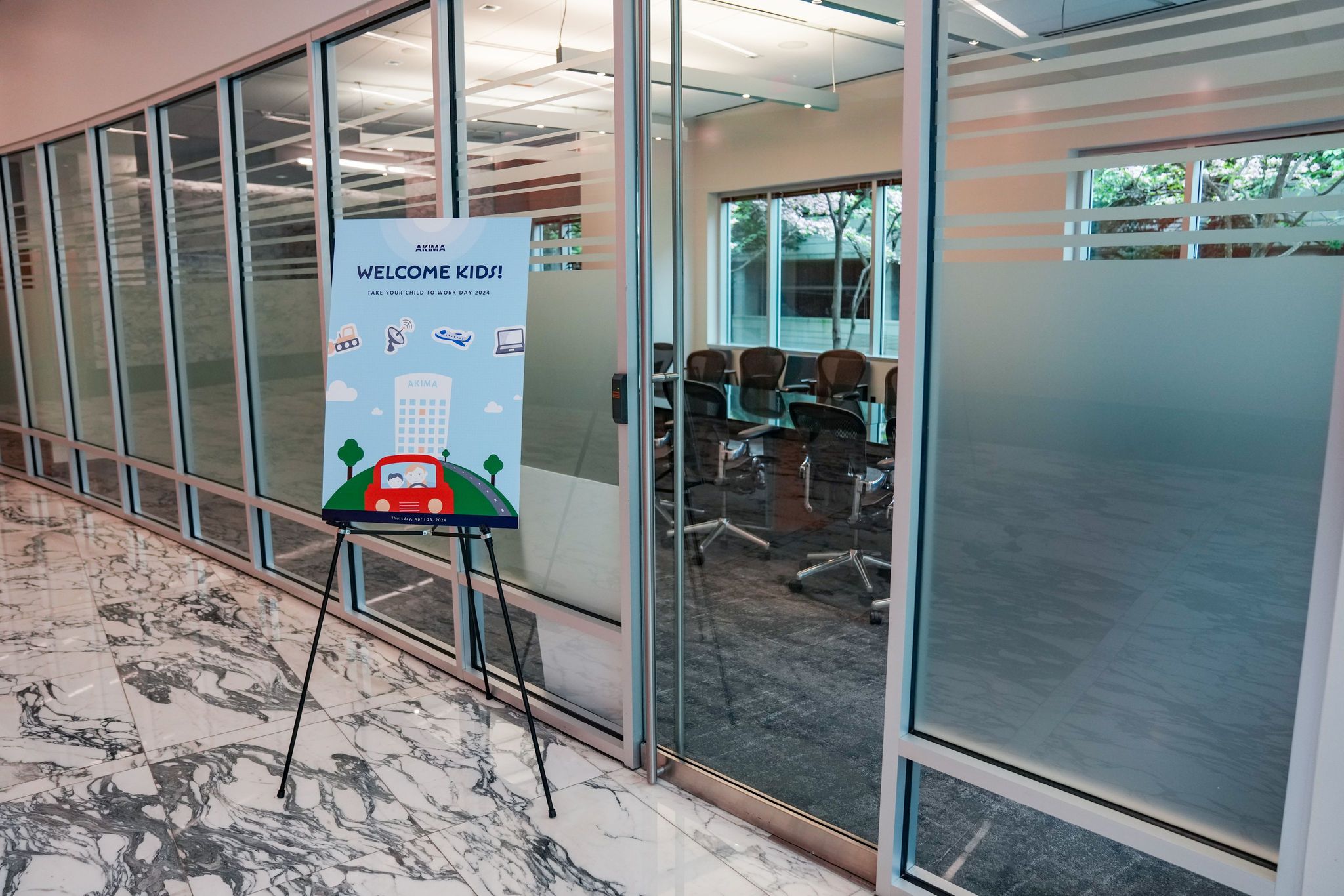
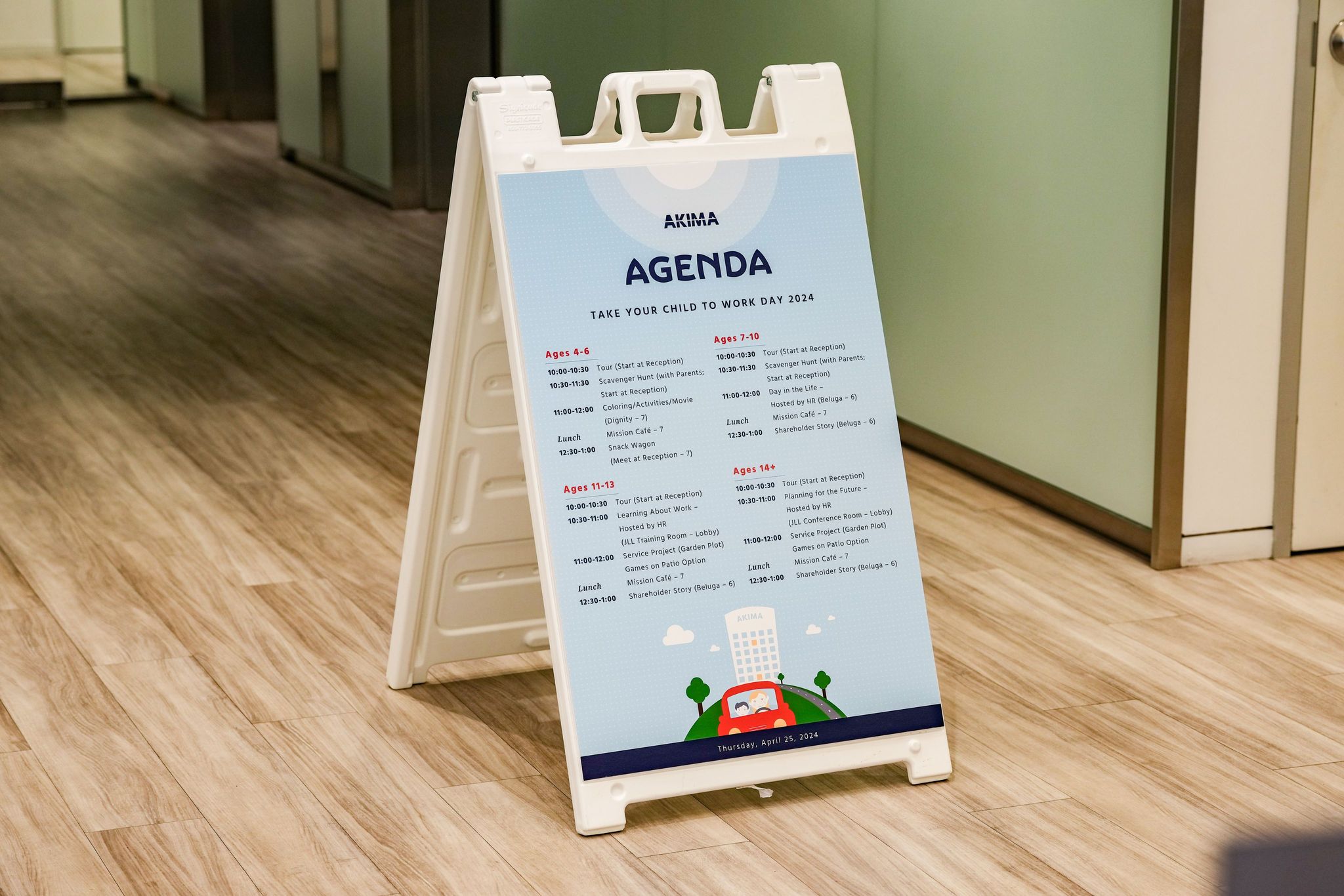
Take Your Kids to Work Day was a corporate event that gave employees an opportunity to bring their children to the work environment to learn about the company, various jobs, and to inspire them for their future. The audience was employees and their children. Therefore, the vector illustration was designed within the company brand, with a fun, and a light feel to it.
Software used: Adobe Illustrator
Project 11: Shareholder Awareness Month
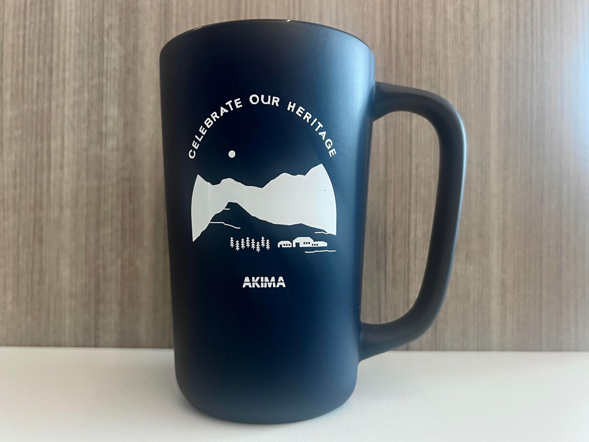
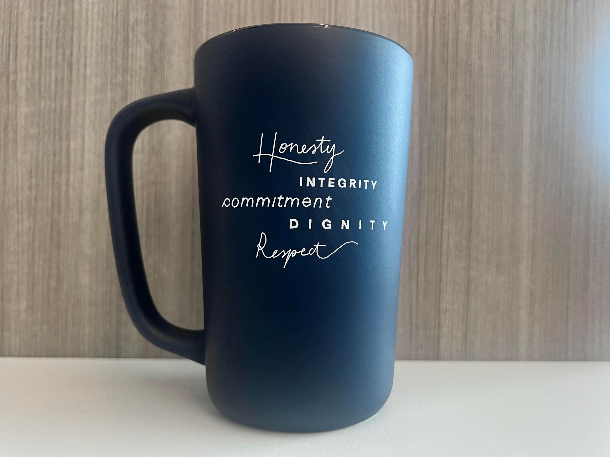
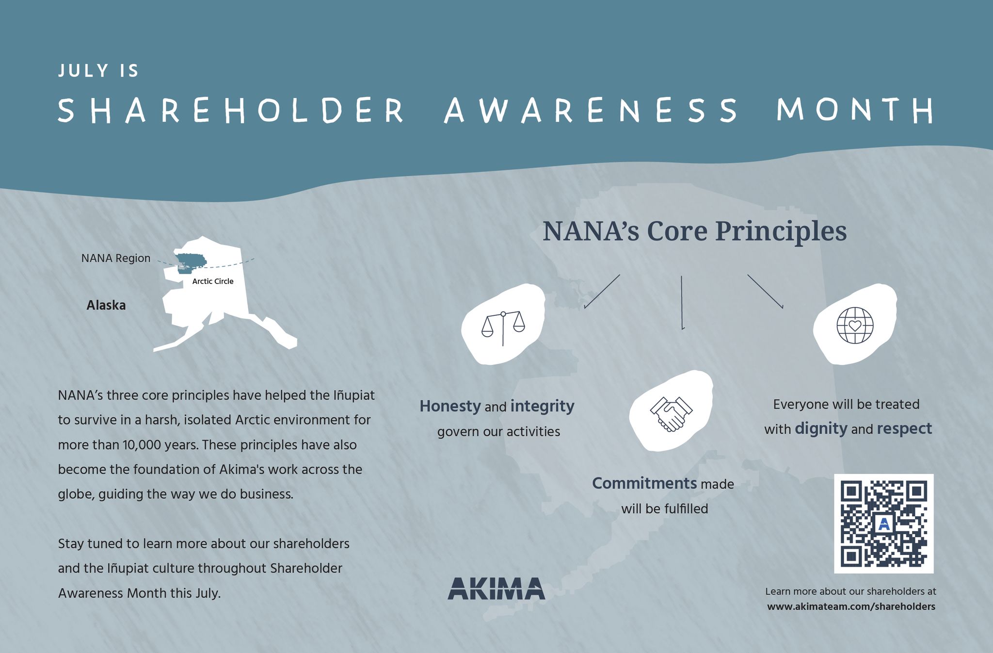
Shareholder Awareness Month that takes place in July celebrates the company shareholders. Several design items were created including posters, elevator signs, half-sheet design, mug design, and table tents. These items were designed by keeping in mind the overall company brand, the specific event brand, and the audience who are the company employees, and our shareholders. Software used includes Adobe Illustrator and Adobe InDesign.
Software used: Adobe Illustrator



Project 12: Ice Cream Sign
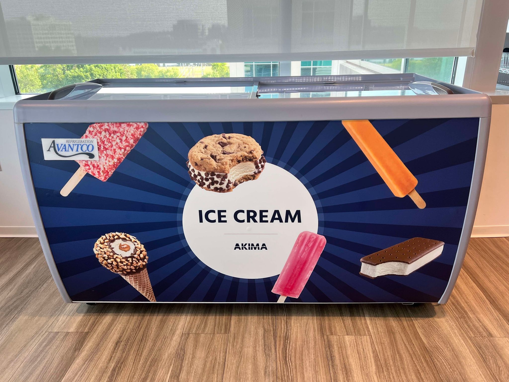
The Akima Ice Cream Sign was designed for Akima employees with company branding with a display of numerous ice cream provided.
Software used: Adobe Illustrator and Adobe Photoshop

Project 13: Digital Banners
Software used: Adobe Illustrator and Adobe Photoshop


Project 14: Billboard Design
Billboard designs were created in Photoshop and Illustrator using the Akima brand, which includes using a midnight overlay for photos, white space for contrast, Noto Serif typeface for the headline, and an orange call to action button. The first layout shows a diagonal angle, and the second layout shows curves, which are two styles that are a part of the AKIMA brand guideline.
Software used: Adobe Illustrator and Adobe Photoshop


Project 15: Postcard Design
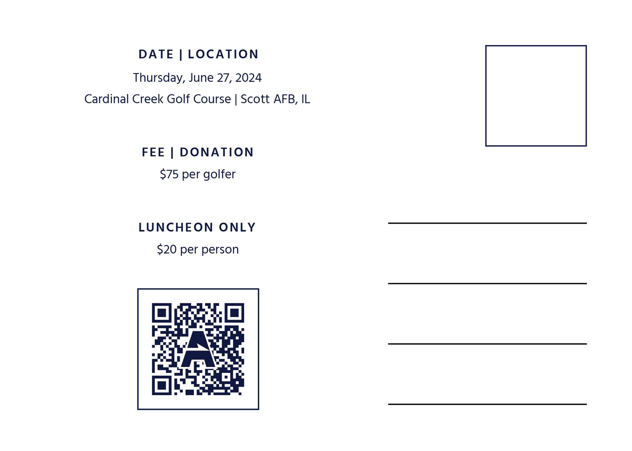
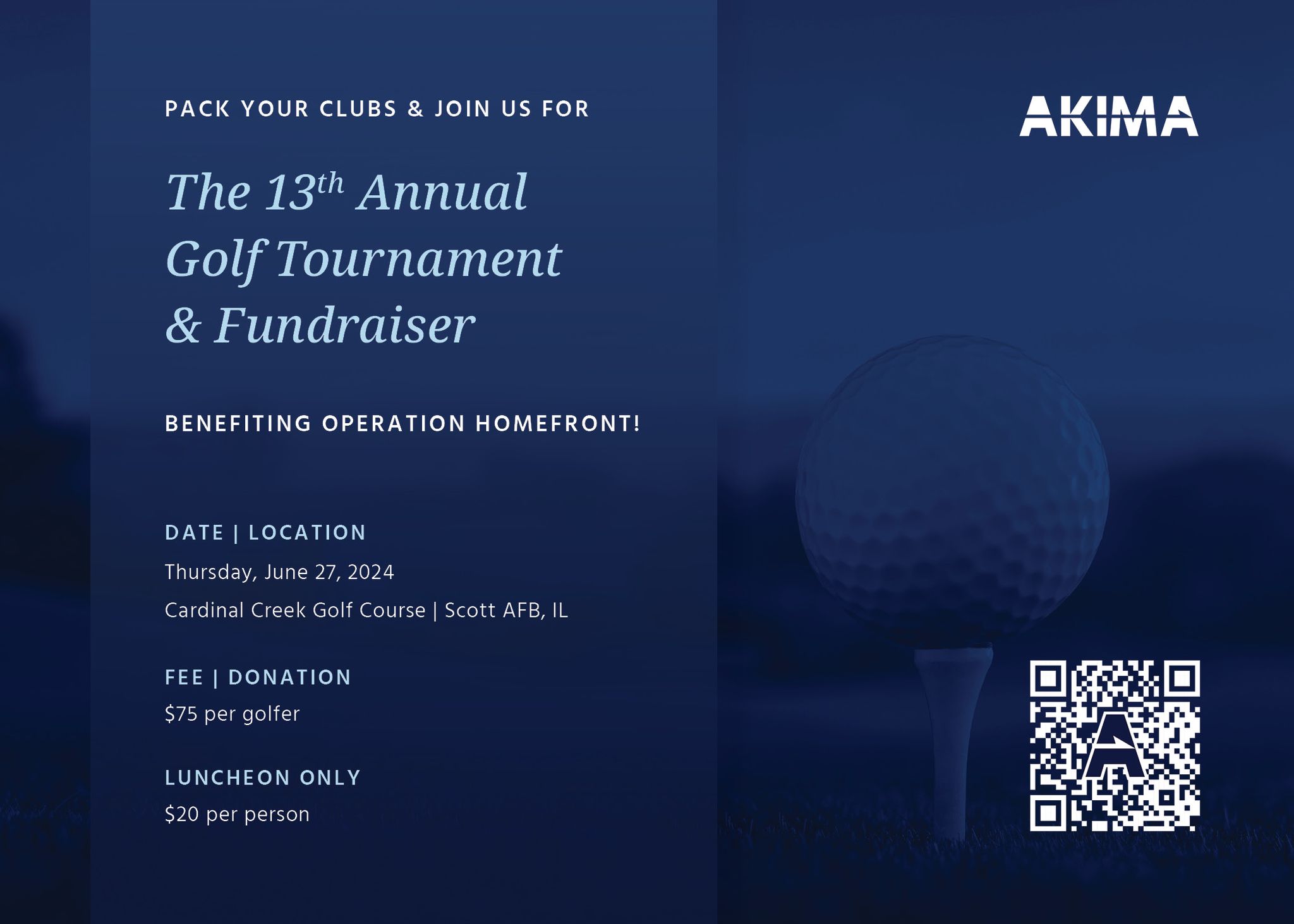
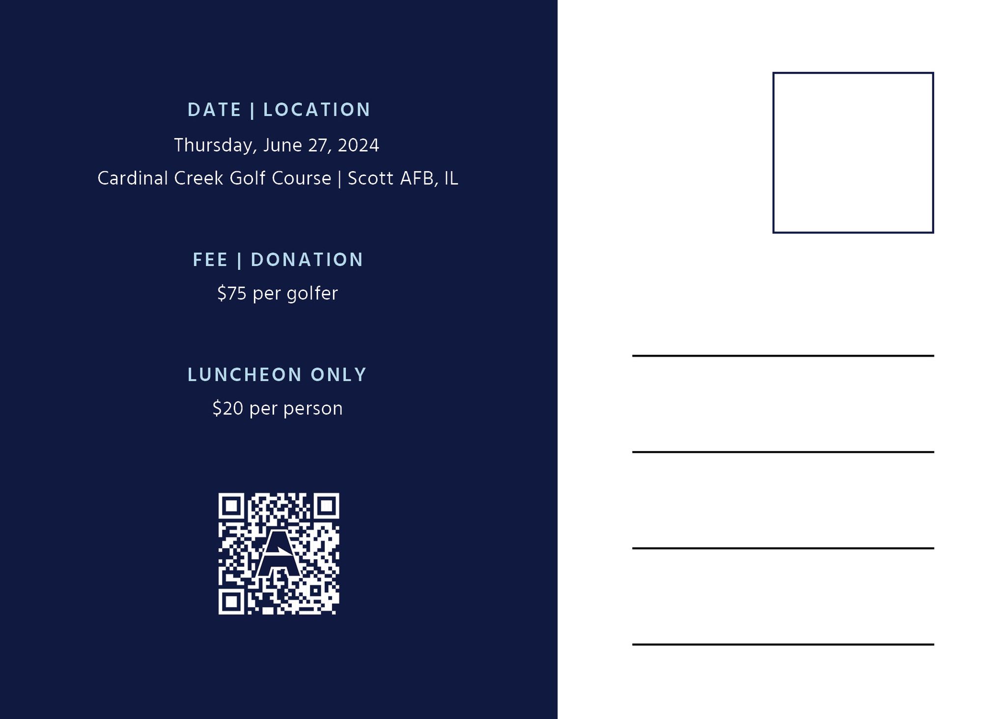
A golf tournament postcard was designed for an Akima sponsorship event. Noto Serif typeface was used for headlines, and Hind was used for the body copy. Image was photoshopped to have a midnight blue overlay. QR code was created in Adobe InDesign and the Akima A was designed in Adobe Illustrator.
Software used: Adobe Illustrator, Adobe Photoshop, Adobe InDesign

Project 16: Flyer Design
Software used: Adobe InDesign


Project 17: Event Collateral
Event poster was designed to be placed on an easel. Table tents were created to showcase information to the audience on tables and counters. Both designs were created using elements of the AKIMA brand: white text, a midnight blue background with an overlay for contrast, thin lines, and orange to highlight details.
Software used: Adobe Photoshop, Adobe Illustrator, Adobe InDesign


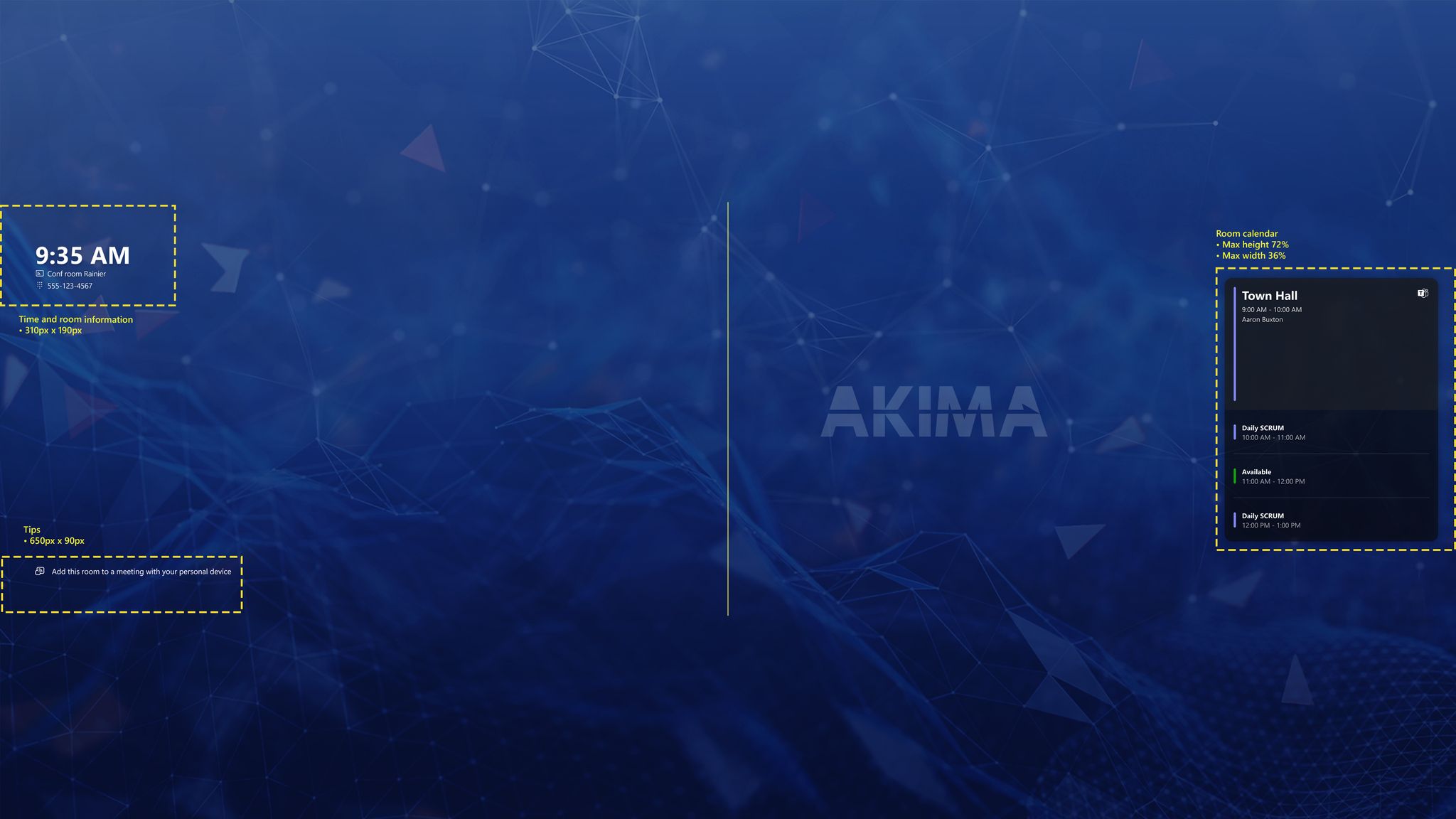
Project 18: Monitor and Console Display Design
Software used: Adobe Photoshop
Project 19: The House of Representatives Poster
Event poster was designed to promote the new cherry blossom festival items at the House Gift Store.
Software used: Adobe Photoshop, Adobe Illustrator

Project 20: Company Branding: Kimpton Banneker Hotel
Case Study & Design Brief:
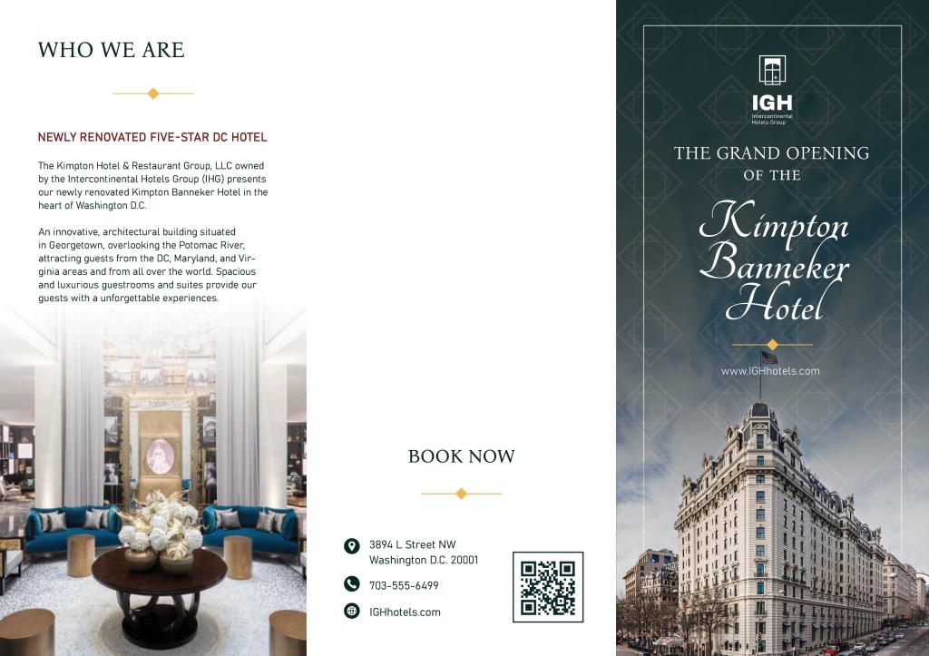
You are a recently hired Graphic Designer for The Kimpton Hotel & Restaurant Group, LLC owned by the Intercontinental Hotels Group (IHG). IHG has most recently unveiled their newly renovated Kimpton Banneker Hotel in the Nation’s Capital. IGH was very excited for this opening, but the results have been less than stellar with annual sales dropping, foot traffic decreasing, and restaurant & bar spend lagging. They need you to create a solution to quickly turnaround results and salvage their investment.
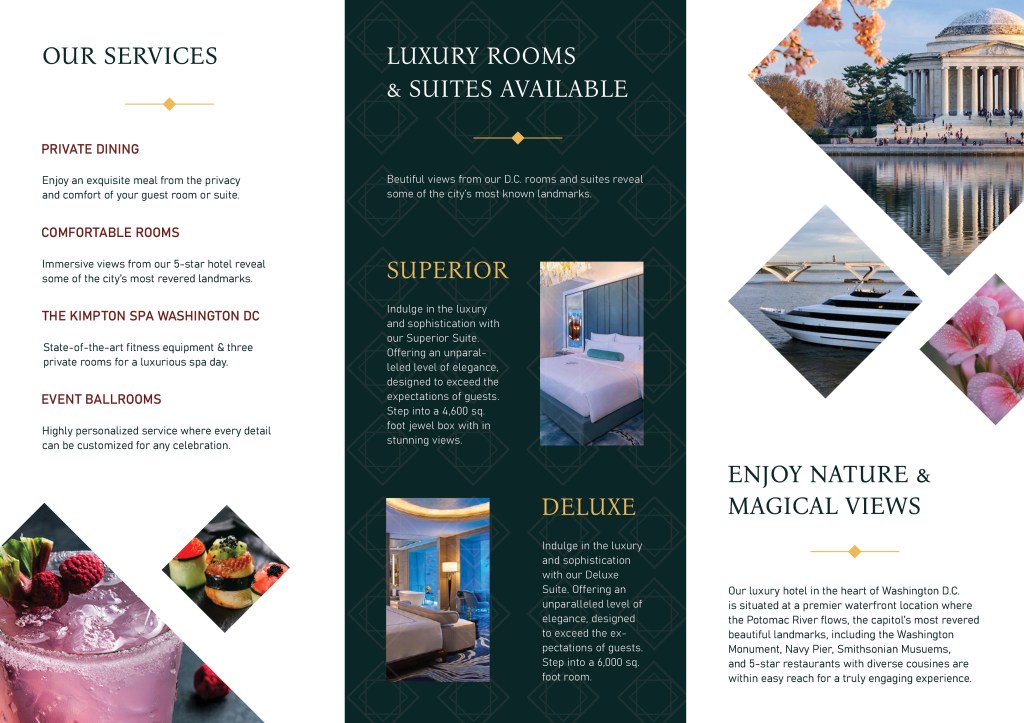
Goal: Kimpton Banneker Hotel is a five-star, luxurious, royal, sophisticated hotel in Washington D.C. Produce eye-catching graphics that best communicate and connect with company stakeholders to increase hotel annual sales, foot traffic, restaurant & bar spend
1. Visually-compelling brochure about Kimpton Banneker Hotel’s grand opening and why consumers should visit
2. Three social media posts for Instagram, Twitter, and LinkedIn from the restaurant & bar
that will engage and entice consumers
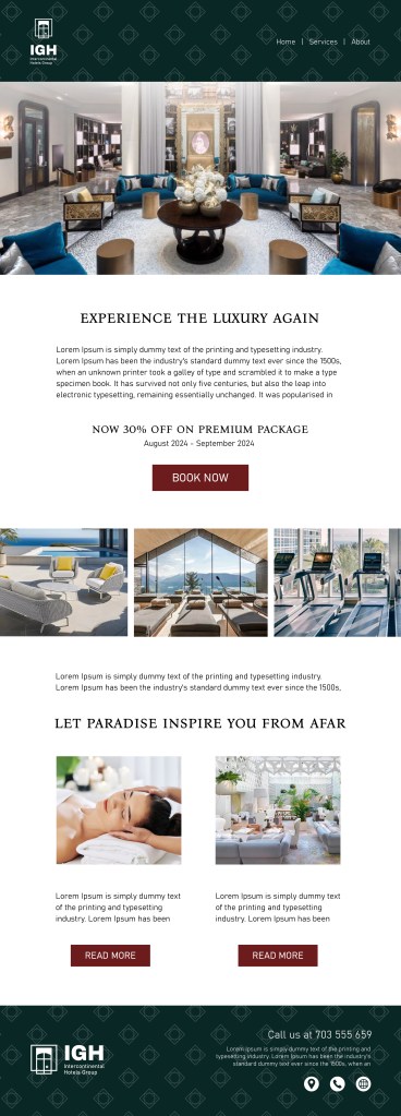
3. Innovative & dynamic email campaign layout to engage existing consumers to return to the hotel
Software used: Adobe Photoshop, Adobe Illustrator, Adobe InDesign
Company Brand Guideline: Colors, Logo, Typeface, Patterns & Shapes

Brochure
E-mail Campaign
